Thursday, June 30, 2022

TAD: Colourful June: Silver & Gold

The theme for Rain's Thursday Art Date this week is silver and gold. Since I've been doing the "colourful June" series with photos of flowers and garden, I admit I was stumped about silver and gold. I usually think of these as metallic colors, although with flowers, golden yellow is sometimes called gold, or silver grey is sometimes called silver. 

After some pondering, I decided to exercise some artistic license and interpret silver and gold metaphorically. So, I present to you, my homestead silver and gold.

Compost is truly garden gold.

Homegrown eggs and milk.

The garden.

The fruit of our labors.

Winter warmth.

Honestly? These things are worth more to me than money in the bank. 
These are our homestead silver and gold.

All images © by Leigh at Leigh's Photography Journal

Wednesday, June 15, 2022

TAD: Colourful June: Red

Joining up with Rain's Thursday Art Date.

My interest in photography is primarily in documentation, so my aim is to make my photographs as accurate as I can in terms of getting them look like what my eyes see. Cameras don't see the same as human eyes, so learning how to take real-looking photographs has been a goal. However! Rain's Thursday Art Date gives me an opportunity to explore photography as an artistic medium. I can experiment with settings and software editing in ways I otherwise wouldn't! Very fun.

Last week's lesson in my online photography course was Advanced Edits. That link will take you to what I learned and my homework assignment. I continued to play around with it and here's what I came up with to share for TAD.


All images © by Leigh at Leigh's Photography Journal

Saturday, June 11, 2022

AYWMC: Part 5 Editing. Lesson 4: Advanced Edits

This post is part of a series entitled A Year With My Camera.

Lesson 5.4 in my own words

  • Split Toning
    • Changes the colors of dark tones and highlights separately.
    • In darkroom developing, it adds a golden sepia tone to black and whites.
    • With digital developing (editing), any color can be used.
    • Lightroom updated split toning to "color grading."
  • Graduated Filter
    • A type of neutral density filter (from "What is an ND Filter and Why You Need One.")
      • A filter is a glass or resin camera lens attachment that impacts light hitting the camera's sensor.
      • Examples: UV filter, polarizing filter, etc.
      • An ND filter
        • Reduces the amount of light hitting the camera's sensor.
        • Allows wider aperture and longer shutter speed in bright conditions.
    • In editing software, it applies an exposure adjustment in the form of a gradient.
    • It's like a sheet of clear plastic graduated from black at the bottom to clear on top and placed over an image.
    • Very useful for bringing back detail to blown out skies in RAW images
      • RAW images retain information about the details of the clouds
      • JPEGs discard that information when processing the image.
  • Cloning
    • How to deal with dust, specks on an image, annoying highlights, or other distractions.
    • Samples one area of an image and allows you to paint over the flaw.
    • Done with "clone" or "heal" tools.
  • Vignette
    • Darkens the area around the subject.
    • Can draw subtle attention to the subject of the photo.
    • Be careful not to overdo.

This week's project
  • Pick one or two of the advanced edits to experiment with.
  • Don't worry about trying to keep the edits realistic yet. The point of the module is to learn what your editing software can do.

Graduated Filter. This was the first technique I wanted to try. And I knew exactly what image I wanted to experiment with. It's one I took for my homesteading blog last month. The subject was muscadine vines growing on the pergola. The day was sunny and the sky was blue with white and grey clouds. The photograph however, made the sky look like a high overcast. Nothing I tried in GIMP could fix it. 

Original JPEG produced by my camera.

The I loaded the RAW version of the image into RawTherapee, my RAW editing software, and started to experiment.

RAW image corrected with the graduated filter.

That second photo looks like what I actually saw! Even though it's been edited with computer software, it's the more accurate image of the two.

Vignette. I understood this better when I started playing with the tool. The first image below is without the effect applied, the rest are gradually increasing it.

Original unedited image.

Vignette effect applied.

A little more.

And a little more.


Split Toning. Sometimes called "color toning." It is called "color correction" in RawTherapee. This is another one I had to experiment with to understand. For my image, I chose cloudy sky, because everybody knows what sky is supposed to look like. 

Original unedited image.

Here are my experiments. The assignment said not to worry about realism, so I didn't. 

Hue adjusted. (I went for wild!)

Then I adjusted highlights.

Shadows adjusted.

Lastly, mid-tones adjusted.

I didn't experiment with cloning, because I'm already familiar with it. 


What I learned

  • The graduated filter is extremely useful. I thought my problem with the washed out sky was due to my lack of camera skills, but now see it's a limitation of the camera. I know I'll use this in the future.
  • Vignette is nice to know about, but I doubt I'll use it much.
  • The Vignette feature in RawTherapee is much more subtle than the one in GIMP.
  • Split toning is interesting, and I can see using it for artistic versions of images. 
  • I think a lot more can be done with the split toning, but that's more advanced than I can comprehend at the moment.
  • Because I think of my photography as accurate record keeping, so I'm not sure I'll use this feature much. 
All images © by Leigh at Leigh's Photography Journal

Wednesday, June 8, 2022

TAD: Colourful June: Yellow

Rain's Thursday Art Date (hit that link!) is giving me great inspiration to apply what I'm learning in A Year With My Camera, a wonderful free online photography course. This week I'm combining Rain's theme of yellow with the lesson on tonal editing. My edits are made by tweaking shadows, mid-tones, and highlights. The originals are JPEG copies of RAW images before editing.

Original

Edited

Original

Edited

Original

Edited

All images © by Leigh at Leigh's Photography Journal

Friday, June 3, 2022

AYWMC: Part 5, Editing: Lesson 3, Tonal Edits

This post is part of a series entitled A Year With My Camera.

Lesson 5.3 in my own words.
  • Tones in an image are simply the shades of grey.
  • Most editing software splits them into 3 broad groups:
    • dark tones
    • mid-tones
    • highlights
  • Pure black and pure white would be on the ends.
  • The better quality image editors allow adjustment to each tone group separately, e.g., tonal curves in Lightroom.
  • Editing the tone groups separately allows you to keep detail. For example
    • Not losing detail in light areas when lightening dark tones.
    • Not losing detail in the dark end when darkening highlights or mid-tones.
    • It helps to imagine the photo in black and white.

This week's project

Create at least 2 completely different edits from the same photo, just using the curves tool, or dark tones/light tones sliders.

GIMP has a color curves tool, but not a tonal curve tool for dark, mid, and highlight tones. So my homework was done on RAW images in ART with sliders.

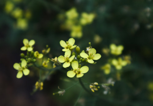
I started by experimenting with images of flowers and goats. I could see changes, but they were subtle as the shadows, mid-tones, and highlights were subtle. This week's project wants two completely different edits from the same photo, so I chose the same scene that I used for last week's project, but under different conditions. In lesson 5.2 the photo was taken before sunrise on a foggy morning. For this lesson, the photo was taken a couple hours after sunrise on a clear morning. I like that it has distinct shadows, mid-tones, and highlights with which to experiment.

Original from the camera

In my edited photos, the shadows were lightened the same, but the mid-tones were the opposite and highlights were decreased for edit #2. The changes are subtle, so I suppose it's a matter of which image is instinctively more appealing to the viewer.

Tonal edits #1

Tonal edits #2

What I learned
  • Tonal edits can subtly bring out details that are originally visible to the eye, but less so to the camera. 
  • It's a way to draw attention to a particular area of the image.
  • The differences can be subtle or intense.
  • In the end, it's a matter of personal taste.

For my records, here are the individual edits I experimented with before putting them all together.

Original with only shadows lightened

Original with only mid-tones lightened

Original with only mid-tones darkened

Original with only highlights darkened

And because I couldn't leave it alone, here is my tonal edit photo #1 (above), with a few more tweaks.

Tonal edit combo with slightly increased saturation.

Same as above with color temperature cooled slightly.

I have to add that I understand why we were instructed to take our images in the largest size our camera allows. It's a lot easier to see the changes when the image is 6016 pixels by 4012 pixels, than at the 500 x 333 I post on my blog. But the blog posting size is a matter of space and loading time, so while it's a good record, it's not perfect.

All images © by Leigh at Leigh's Photography Journal

Thursday, June 2, 2022