Lesson 5.2 in my own words
- Recommended editing workflow
- Take photo
- Download photo to a place where you can find it again
- Backup your photo so it is archived (in a different place)
- Format your memory card so it's ready to use again
- Edit your photo (preferably non-destructively)
- Share your photo (online or in print)
- Three types of color editing to start with.
- Saturation and vibrance
- Increasing saturation makes the colors more intense
- Can make the image pop
- Can be overdone
- Some editing software has a vibrance adjustment option.
-
Similar to saturation but the color is detected as saturated, vibrance
won't increase saturation
-
Most photos are improved with a slight increase in saturation or
vibrance (especially those shot in RAW).
- Black and white
- There are many ways to create black and white images.
-
Desaturation - slide the saturation slider all the way to the left.
- Software presets or filters - like "sepia tone" or "film noir".
-
Black and white conversion - found in most photo editing software.
-
Apps and add-ons - specific to various devices, operating systems, and
editing programs.
-
Color temperature (again)
- Can correct color
- Can add a warm or cool feeling to an image
This week's project
- Try one or more of the techniques in this week's lesson.
- Experiment with over-editing.
-
Try minimal edits that enhance your image without being immediately apparent
(especially important when editing portrait shots, to not create odd colored
skin tones).
I'm trying to learn two different image editors: GIMP for JPEGs and ART for RAW.
So, I've done a set of color edit experiments with each. Initially, I was
tempted to include some of the edits we learned in
the last lesson, but decided to just experiment with the edits in this lesson to better
understand what they do.
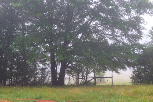
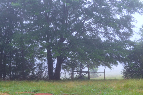
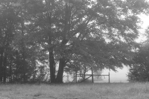
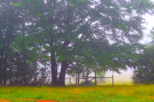
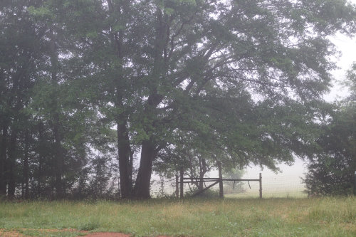
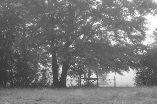
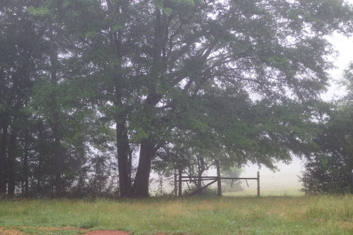
The photo was taken on a foggy morning just before sunrise. It's a little
bland and could use some color tweaking.
JPEG in GIMP

|
| 1. Original JPEG |
|
| 2. Saturation 1.5 |
|
| 3. Saturation 1.5 and color temperature 5000.
|
|
| 4. Saturation 0.0 (one way to create a black and white)
|
|
| 5. Saturation 3.0 (oversaturated)
|

|
| 6. Saturation 3.0, Color temperature 3500
|
RAW in ART
|
| 1. Original |

|
| 2. Saturation +38 |

|
| 3. Saturation +100 |
 |
| 4. Saturation +100, Vibrance 100 |
|
| 5. Saturation -100 |
|
| 6. Vibrance 25 |

|
| 7. Vibrance 35 |

|
| 8. Saturation 38, Vibrance 13
|
What I learned
- I thought GIMP and ART did a comparable job in these color edits. ART, however, is more nuanced and offers a lot more options (which means more to learn).
- GIMP doesn't have a separate vibrance edit option, but seems to combine vibrance with saturation.
- The numbers don't seem to have a standardized meaning, but are comparative for the individual program.
- I didn't see a whole lot of difference with vibrance in ART until I went with 100% saturation and 100% vibrance.
- What's a pleasing outcome is very much subjective!
- I had some trouble with saturation in ART, as it wouldn't apply to some images. One of these days, I'll go through the manual (all 554 pages!) and maybe figure it out.
- This exercise whetted my to experiment even more.


5 comments:
Leigh, color enhancement is always an odd thing to me. On the one hand, it can add a great deal to the picture. On the other, I sometimes think it can give us a skewed view of what the real object can look like. The Grand Canyon was beautiful, but certainly not in the same way as some of the enhanced pictures (to bring out the colors of the strata) make it appear to be.
TB, I agree. On the one hand, what the camera records is often not what the eye sees, especially in regards to color. I like being able to adjust the photo to look more like how it looks to me in real life. On the other hand, we have always relied on photography to be an accurate record of a moment or event. But "the camera doesn't lie" isn't a true statement anymore. It's possible to do anything with an image thanks to sophisticated editing software. As with all of technology, that's just the way it is. I admit that because of that, I view photographs differently than I used to. More like paintings, I suppose; reality based, but with a generous dose of the artist's creative imagination.
Another factor is computers and printers. Monitors and software display colors differently. For example, monitor color is adjustable. Web designers have a palette of 216 web colors that are said to render the same in various OSs and browsers. All other colors are iffy. Printers too, print color differently. I suppose it ends up being a guessing game with the caveat that color may or may not be accurate.
I had not even thought of the printers or monitors (or other displays - thinking of phones and flat screens) - but you are exactly right. They all display a little differently.
Understanding that has freed me from worrying I'm doing something sneaky with the editing. In several of the lessons we were told to compare what we see in the viewfinder to what our eyes see and then try to figure out how to improve the photo to match. The extension of that is editing software. It's still subjective, but I like being able to more toward a more accurate representation of what I saw.
Post a Comment