This post is part of a series entitled A Year With My Camera.
We're out of the technical lessons and on to the fun stuff!
Lesson 2.1 in my own words
- Good composition is a balance of 3 key elements:
- Foreground - traditionally a small element that leads the viewer into the image
- Background - offers context and contrast but doesn't distract
- Subject - best to stick with just one subject
- Whole frame
- Choose the composition in the frame then step back and take in the entire image
- Check for balance
- What path with the viewer's eye take into the photograph?
- Use viewpoint to change the balance of the elements
- Move the camera or yourself to change your point of view.
- Visualize what you want and think how to get it
This Week's Project
Use the same subject and take 5 different photographs by changing only
viewpoint.
- Mostly subject
- No foreground at all
- Mostly foreground
- Mostly background
- A pleasing balance between all three
 |
| Mostly subject |
 |
| No foreground |
 |
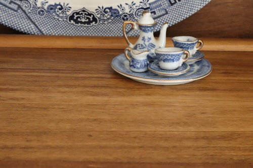
| Mostly foreground |
 |
| A pleasing balance of all three. (I hope). |
What I learned
I've had a lot of art classes, so the information about composition was pretty familiar. For photographs, I'm always aware of background clutter (the cutest baby pictures aren't so cute when there's a mess everywhere else!), but for composition, I've always relied on my crop tool in Gimp. I didn't do that this time but worked with point of view to compose with just the camera.

No comments:
Post a Comment